Thursday 28 March 2013

DC - Response from Gary at packaging formats


Hi Stephanie
Good to hear about your interest in the packaging side of the business and I will give you as much feedback as I can.
Most of my work is Presentation packaging and I don't get involved with the Food or Drink side as its so specialised.
My favourite food packaging at the moment is the Dorset Cereals range,really good graphics with cut outs to the front and
side so you can see what's inside the pack.They have also been clever with the printing as its actually printed on the reverse
side of a one sided board to give it a "textured recycled look" and then finished it off with foil blocking giving it a really high
end look which results in a high price, although I must say the contents are delicious!
The most interesting food packaging I have come across was some Christmas Fudge cartons from a couple of year's ago 
and I have attached some photo's to show how it folds from being flat to a 3 dimensional box, it still fascinates me every time
I fold it, and just by changing the graphics and the material it could be used for lots of other products, although it looks quite complicated, its produced from a flat sheet of board, printed, die cut and glued just like a normal carton, its the fold over top
that does it for me!
Both these show the importance of good design in packaging as they both could look really naff with the wrong graphics, if it
looks good from the outside its usually good on the inside!
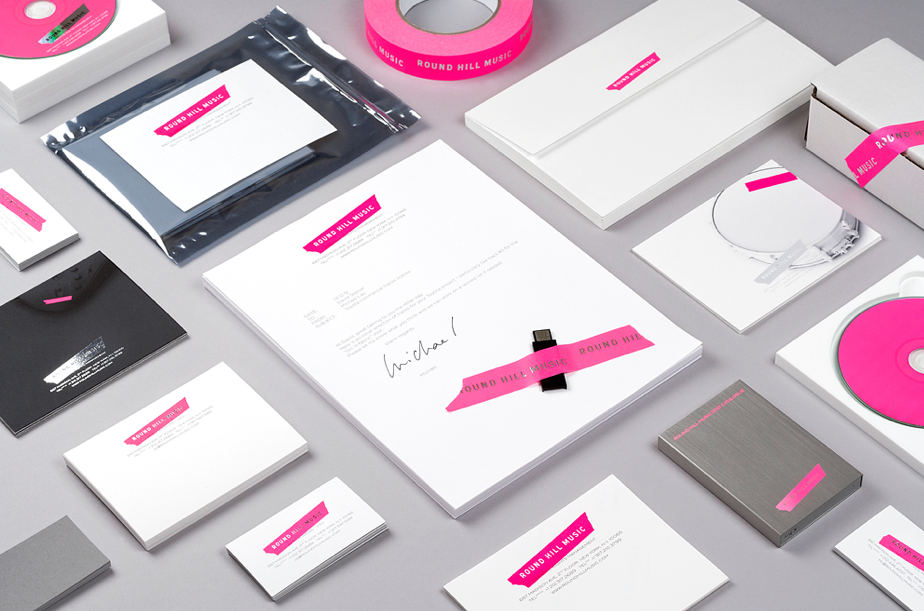
All my packaging projects are bespoke and are driven by different stocks, print processes, and unique materials, but the most important thing before I start coming up with ideas is to find out the budget as this will determine which route I go down, its pointless designing high end packaging if the customer hasn't the budget.
Once I have an idea on unit costs I can then design the packaging to suit the budget, so it could be a simple corrugated mailer
that's screen printed costing £2.00 per unit right through to a paper covered box with hidden magnets costing £30.00 per unit.
Hope that helps with your project
Gary


DC - Just in case packaging range

http://lookslikegooddesign.com/just-in-case/

Although not entirely food packaging design, I tihnk it would be good content for my publication as it shows how food and drink can work with as a set with other items, alongside a concept pulling them altogether.


DC - Nudge Branding - Cork lidded packaging

Source: http://lookslikegooddesign.com/branding-nudge/

Here, I really like the concept of using food like packaging for the candles, using the cork top on a glass container. Although not a food product, it has been influenced by food packaging which I feel makes it appropriate for my publication as content.


DC - Wei Sun

http://lookslikegooddesign.com/packaging-wei-sun/

Wei Sun have produced a high end packaging range for a selection of basic, old, children toys. I really like the choice of materials, stock and subtle hues and tones. This ideally is something I want to create, to this quality and professional standard.


DC - Winter Warmer

Source: http://serialthriller.com/post/40833275927/theoinglis-winter-warmer-by-exeter-based

“Each year we send out a festive ‘Mulled Wine’ to clients and friends. Mulled wine is a traditional winter drink served warm, making it the perfect tonic to banish those winter chills…This year saw the birth of BUDDY’S ORIGINAL WINTER WARMER. The only sure and trusted way to ward off the icy claw of winter, and survive the manifold strifes of the festive season.”

This 'Winter Warmer' product is something which has been designed to look of a certain age, to look like a vintage wine - this has resulted in it looking very high end, but essentially something cheap to produce, using just black on white, and a simple paper and sticker wrap for the outer packaging, but managed to retain a quality and fines about it.


DC - Thrift Box - Round Hill Music

Source: http://www.septemberindustry.co.uk/established-nyc/

I'm not particually looking at the design of this range in relation to Thriftbox as I'm sure it doesnt reflect her products, but instead the range which has been designed. The idea of using a craft material to create a logo is something I feel is something which could be used - here they have used a tape material, which has then been pushed into the packaging elements. With Thriftbox I could use a material appropriate to the items she makes. I also like the huge extent of the range of this line of products, and is something I should consider in the design stages of Thriftbox.


Wednesday 27 March 2013

DC - Response to Questions


Equator Design:

Hi Stephanie,

I hope you are well, I have answered the below questions in regards to your email to Vanessa Christian at Equator Design.


What is your current favourite food or drink packaging design and why? I would say Cadbury's Egg & Spoon (for Easter), really like the concept of having the design in an egg box:http://www.cadbury.co.uk/products/Egg-%27n%27-Spoon-Chocolate-Mousse-3518?p=3518


Whats the most interesting and unique food or drink packaging you've ever come across? Please source if possible: Ever? That is hard! Of the last few years, I would say this Puma bag: http://www.puma.com/cleverlittlebag Again, conceptually it is brilliant and it also considers sustainability.


How important do you think the design of a food or drinks packaging is? Very, imperative. If everything was in white packaging, which would you buy and why? I do look on the back labels of all the products I buy when making my choices, especially in supermarkets, but to say that I am not also influenced by the packaging would be a be a lie

Have stock and printing processes driven any of your packaging briefs, if so which and why? Yes, see our Equator Beer on our website. It's very unconventional for a beer label, but the minimalism of the design and the texture captures the imagination and makes it stand-out despite it being a part of a very busy marketplace.

Kind Regards,


Ben L


Sources: 


Tuesday 26 March 2013

DC - Brief 5 - Egelnick and Webb

http://www.septemberindustry.co.uk/egelnick-and-webb-recent-projects/

I came across this beautiful work abnd thought it was so fitting with the kind of thing and level of consistency me and Sophie are trying to achieve within our work. Pushing the floral designs across a range of stationary, and further into some kind of look book is something we wanted to do originally, these designs below show how well it can work if applied well. Retail graphics isn't something we had considered yet, but after looking at the window design below and think its something we must consider.


Friday 22 March 2013

FMP - Brief 3 - Booklet 1 further changes


DC - Brief 3 - Quibik

Source: http://www.qubik.com/

I was struggling with ways to lay out my content within my dialect publication, and remembered my visit to Joe Gilmores studio and looking through his work how his style would really help me and influence me in what I'm trying to achieve. The way Joe approached type layout is so interesting, and as it's something I really want to get into to, and to be able to produce to a high quality,I'm going to use Joes work as something I strive toward creating.


Thursday 21 March 2013

FMP - 1st Booklet - Further Design


FMP - Brief 6 - How colour effects our appetite

Source: http://allwomenstalk.com/10-facts-about-how-colors-affects-our-appetite/


1. COLORS IN FOOD WE AVOID …

We naturally avoid blue, purple and black foods, as we are programmed to think that these foods will be gone off or lethal. Apart from blueberries, gooseberries and eggplants, there are no naturally occurring foods in these colors. However, some foods are dyed these colors, and it does not appear to have the same effect. Popular sweets Smarties were forced to bring back the bright blue sweet after it received many complaints when it was removed!

2. BLUE FOOD, ANYONE?

Blue food constantly wins the ‘least appetizing’ food award. A study which involved asking contestants their favorite foods, dying them blue and asking them to eat them showed that blue food is instantly found to be much less appealing, even if it tastes normal.

3. THE MOST APPETIZING COLOR IS …

That’s right! It’s red! Red food (as well as the color red itself) is appetite stimulating, creating feelings of intimacy and energy. If you are having a problem with your appetite, bring in some red into your kitchen! I find that having red placemats worked wonders for me, as it makes sure that I am hungry when I sit down to eat. I used to have a real problem with picking at my food, skipping the real meal and then being hungry and snacking later, but my placemats seem to have really helped!

4. YELLOW ALSO INCREASES THE APPETITE …

Yellow is also appetite stimulating, because it relates to happiness. Ever noticed that restaurants have yellow painted windows or yellow flowers at the table? This homely look is to make you feel more welcome, and hungrier.

5. WE EAT AND DRINK WITH OUR EYES

If you change the color of popular drinks, most people will not be able to identify the drink!
“There were a number of studies performed at the University of Washington on how the perception of taste is effected by color. In one study subjects tasted drinks and were able to see the “correct” colors of the drinks, and they were always able to identify the taste of the drink correctly.
However, when they could not see the color of the drink, they made mistakes. For example, 70 percent of the people who tasted the grape drink, said it was grape. With 15 percent of the people thinking it was lemon-lime. Only 30 percent of the people who tasted the cherry drink thought it was cherry. Most people thought the cherry drink was lemon-lime.”

6. GREEN COLOR STANDS FOR HEALTHY?

Green foods are interpreted to be healthy, whatever the food actually is. This is because ‘safe’ foods used to be green, such as lettuce, apples and cucumber. It was quickly established that most green foods could be eaten without a big risk of death, and so our minds are happy to eat anything green, and we are likely to presume that green food is healthy.

7. ORANGE FOODS …

Orange food is usually eaten with caution, as people associate orange with anger. There are very few naturally occurring orange foods, and foods such as curry that contain orange spices are often referred to as ‘angry foods’.

8. THE MOST APPETIZING PACKAGING …

McDonalds’ red and yellow packaging has been voted the best food packaging, due to their clever use of colors. While both colors encourage hunger, they are also very friendly, and memorable.

9. PUT A BLUE LIGHT IN YOUR FRIDGE …

Experts recommend putting a blue light in your fridge when you are dieting, as this will put you off eating. You could also try having a blue colored kitchen, or incorporating some blue cutlery. This should be a brilliant diet aid, and will also give you a very modern kitchen!
10. White color and snacking …
White food is easy to pick at, and to forget that it contains calories. So that’s why it’s so easy to snack on bread! Using a black bread bin could combat this, however.
So now you know the tricks, try using color psychology to your advantage. Need to help your friend eat more? Take a selection of red and yellow foods, and eat from red plates. Trying to diet? Then use blue plates and avoid buying white foods. Simple, right?
Have you got any tips on using colors to control your appetite? Please share them with me

FMP - Re-assessing timetable

I decided to re-devise my timetable for the next 8 weeks, as the orgininal I has drawn up at the beginning of the module was too inaccurate, as other briefs had come along, as had placements.

Re-devised timetable plan:


FMP - Brief 6 - Colours of containers affecting taste

Source: http://www.businessinsider.com/color-of-containers-affect-taste-2013-1

European scientists say they have found further evidence that how you serve food and drink matters hugely in the perception of taste.
Researchers at the Polytechnic University of Valencia and the University of Oxford recruited 57 volunteers and asked them to taste hot chocolate served in plastic cups with four different colours — white, cream, red and orange with white on the inside.
The chocolate was the same in all the samples, but the volunteers found that the flavour was better when the drink was served in the orange or cream-coloured cups.
"The colour of the container where food and drink are served can enhance some attributes like taste and aroma," Betina Piqueras-Fiszman of the Polytechnic University of Valencia said in a press release.
The findings could be beneficial to chefs and food manufacturers, Piqueras-Fiszman added.
Previous research has found that yellow containers boost the perception of flavour of lemons in soft drinks; beverages with cold colours, like blue, seem more thirst-quenching than warm colours like red; and if drinks are pink, they are perceived as being more sugary.

FMP - Brief 6 - How Food’s Hue Affects Its Taste

Source: http://www.divinecaroline.com/self/wellness/color-me-delicious-how-food’s-hue-affects-its-taste


Anyone who doubts that a food’s color affects how it tastes probably wasn’t alive in the early ’90s to witness one of the most infamous gustatory debacles in history. Intellectually, it’s easy to think that the color of a food shouldn’t affect how it tastes, but that was proven false when Crystal Pepsi hit the market. Except for its lack of caramel coloring, it was just like regular Pepsi. It should have tasted exactly the same, but it didn’t. Consumers couldn’t get past the odd juxtaposition of flavor and taste, and the feeling that something was just off. The gimmicky soda was an abject failure, destined to be inducted into the Bad Idea Hall of Fame. 

We know that our sense of taste is very closely tied to our sense of smell, but it’s also tied to our sense of sight. Humans expect their food to look a certain way, and when food has a surprising or incongruous color, our brains convince us that it tastes different, too. Color may not directly affect how a food tastes, but it definitely affects how we perceive the taste. 

What About Green Eggs and Ham?
Added colorings are ubiquitous, and not just in the obvious processed or packaged foods—they show up in fresh foods, too. According to the FDA, colorings are added to food for a variety of reasons. Sometimes pigment is added to offset color loss that occurs in the manufacturing process or from the product’s exposure to light or temperature, which is why farmed salmon’s naturally gray meat is usually dyed to match the pink hue of wild-caught fish. Some manufacturers add color to keep a product standardized; butter naturally ranges from white to dark yellow, but most producers color it light yellow because that’s what consumers have come to expect. Some foods undergo colorization to enhance their natural pigments, such as oranges that are dyed a more vivid shade. Lastly, foods can be dyed to provide color to processed-food products that are normally colorless. Maraschino cherries wouldn’t be red, cola would not have its telltale brown color, and most of the food in thecenter aisles of the grocery store would look quite different if it weren’t for added colorings. 

Color can have pronounced effects on our appetites as well. In Fast Food Nation, author Eric Schlosser wrote about a famous study in the 1970s that examined the effects of food color on taste. Participants in the study were seated in a room where they were offered steak and french fries. Unbeknownst to them, the room was rigged with special lighting that affected the color of the food. Although the plate looked normal in the special lighting, the researchers eventually revealed that the steak had been dyed blue and the French fries were green. Upon seeing the sickly colored food, many participants in the study immediately lost their appetite. When the food was an improbable color, it seemed significantly less appetizing. 

Degustation Discombobulation
In March 2007, the Journal of Consumer Research published a study that found that the color of a beverage also greatly influenced how people interpreted its taste. Researchers offered the subjects orange juice—some of which had been colored, and some of which had been artificially sweetened. When people compared the colored orange juice with regular orange juice, they believed that it tasted different, even though the taste had not been altered. However, when participants were asked to compare the taste of the regular juice to that of the sweetened juice, they couldn’t tell the difference, because they were the same color. 

Food scientists have known for years that color dictates how we perceive taste, and that people expect certain colors to reflect certain tastes. For example, we expect yellow to taste tart, like citrus, and red to taste spicy. When a manufacturer is trying to subtly encourage a specific flavor, the easiest way to do that is to give the food a particular color. If a product’s color does not correspond with its flavor, consumers get confused. In a 1995 study published in the Journal of Food Science, participants could not identify the flavor of a drink if it did not correspond with the “appropriate” color. For example, they could not identify grape flavor if the drink was colored red; instead, they thought it was cherry or some other “red” taste. The participants in this study reported that drinks with stronger colors had stronger tastes, regardless of the beverage’s actual flavor concentration, and that the drinks with strong colors also tasted better than drinks with weak colors. 

Another study (from 1983) in the Journal of Food Science found that foods were judged to have a stronger and more powerful aroma when they were colored, as compared with versions of the foods without added color. The precise hue of the food was important, too: participants disliked foods that were either too colored or not colored enough, instead preferring foods that had enough coloring to be bright and appetizing, but not so much that they looked artificial.

Taste the Rainbow
The way we experience taste is intricately wrapped up in how food looks, feels, and smells, long before it ever makes it to our mouths. Without the proper visual cues, it’s almost as if flavor itself has no context. To some, the thought of injecting color into naturally colorless fish or dying maraschino cherries may sound nauseating, but food companies take their products very seriously, and they know that even though consumers express general dislike for the idea of chemical additives, they also have very specific expectations about the foods they consume. Most people would overwhelmingly prefer pink salmon meat to gray, and people are more likely to buy key lime–flavored sweets if they’re dyed green. I may think I’m opposed to food coloring, but in my cocktails, I know that a pale and colorless maraschino cherry just wouldn’t taste the same.