
Thursday, 23 May 2013
End of Module Evaluation
When first approaching this module I had
some sense of what I wanted to achieve by the end of it, this was to have a
substantial amount of conceptually driven work, which retained my interest
within illustration and Print, with a focus on the Retail Environment. This has
remained the same, and I believe it has been achieved. I was lucky to have
a clear sense of what I wanted to do at the beginning of this module, regarding
the area of the Graphic Design industry I wanted to sit in. Knowing this I have
been able to write and chose appropriate briefs, which I have enjoyed and have
been beneficial to my practise and portfolio.
Although having a clear sense of what I
wanted to be, and do, by the end its really made me realise who I am as a
designer, how I work and whats generally important to me when I approach a
brief. I realise I have a systematic approach to design work; after having a
few interviews and each asking how I work, it put it into perspective for me. I
am someone who thrives on the research element, finding it the most important
and rewarding part, being able to find something really interesting, which
would communicate an idea, or give a real sense of what a company or person is
about. I feel that it's so important to do the ground work, before approaching
the designing stages - its gives real meaning and definition to design choices,
rather than doing something, because you think it looks good. This is most
evident in my '10 Things' brief, being someone who reflects my own lifestyle
into my work, I wrote a brief dedicated a problem, which I experienced.
Children who come from deprived areas generally have a lower academic ability,
so I did extensive research on what topics children needed to learn before they
went to school, regarding both sensitive and academic problems. This was
achieved through reading articles, and interviewing teachers, and the outcome
was a product range designed to aid the teaching of these topics to children,
supplied by the childrens centre, Surestart. The information I gained in the
research and interviews was key to understanding my target audience and their
abilities, and the way they could interact with a product. The outcome: a real
solution for a real problem.
I have realised, more toward the end of
the module, how much my design outcomes rely on print, finishing and binding,
but not because it has too, but more for my enjoyment of it, and my tactile
nature. I love physically created something that a person enjoys not only
seeing, but feeling, and touching. This began in Brief 2, when I decided that
Douwe Egberts coffee had a heritage which could be communicated through
original ways of printing and forms of approaching packaging. I screen printed
onto Hessian fabric - something which both looks old and feels old, which is
the ethos I wanted. My love of print goes beyond just that, and has become a
representation or a appropriate direction of an idea or concept. This is also
evident in the branding brief I did for Thirftbox, when approaching the business
card design, I considered the nature of the products the company creates, using
embellishing, stitching and a range of fabrics. I decided on a stock which
looked and felt like fabric, to compliment the cross stitch typeface used
within the logo. This was then transferred into the promotional elements of the
branding - a screen printed fabric mail out to promote her range of products.
This was then bound with a cross stitch and sent out to appropriate companies.
The choice of printing methods and finishing not only looked beautiful but
communicated what the company was about, and how they want to be represented.
Throughout my other briefs, I feel like
I've achieved something new or different within each in regard to my skills.
For instance. with the collaboration with Sophie I came to realise my love for
surface pattern design, it's something I've wanted to do for a while but didnt
think i'd be any good at it. turns out, with the positive feedback from
Sophie, I'm actually alright. This and it's application to products,
fabrics and other such items. Within Brief 3, I came to have an obscure love
for typography and layout - something I never thought would happen. Going from
the feedback of others it seems I've become quite good at creative layout. The spoken
content of the publication drove the way I approached the layout, and spoken
dialect and accents have become something of an interest to myself, I've now
done 2 projects on it, and would happily do another. WIthin the final outcome I
did 6 publications, each publication I bound myself, and the main, a more
complex coptic bind. This was something I wasn't too great at but over doing so
many publication has become another skills to add to my portfolio, I've managed
to pick up a range of binding methods quite quickly and deliver them to a high
standard.
Another thing I have learnt within this
module is the importance of time keeping. It has saved my life, I am glad to
have kept on top of it. For this module I have kept a folder full of blank
timetables, which I have filled in weekly to keep me on top of things,
alongside an initial 18 week timetable. It means I know exactly what I need to
do, and by when, and how much time I have to achieve it. Its also meant
i've been able to go for job interviews, do several placements and make up a
strong portfolio of work whilst doing my Final major project rather than at the
end. I feel like I've got a head start, with it i've become confident as a
professional to talk to other creatives, and get in touch with studios.
Applying for a job was something I was really fearful of at the start of the
year, but I've overcome that now I have a body of work which I am proud of, and
can talk about. By talking to professionals throughout my FMP you start to gain
confidence in what your talking about, and my interviews have been more like a
conversation with another creative, rather than something formal and scary.
When thinking about my topic for my
dissertation title, I didn't really know where I stood in the Graphic design
industry, but happened to focus on the topic of consumerism within Tesco - I
never really thought there would be a connection between my dissertation and
choice of briefs, but I have come to understand the huge influence it had on my
practise. I know have a portfolio which is 70% made up of things which could be
purchased and influence a consumer. This especially had a large influence on my
design context brief, and the way I approached organising the content, by the
effect it has on a consumer and a designer, through its aesthetics. I came up
with about 8 categories a packaging design could fall under, which became 8
sole reasons a consumer would purchase that product.
In summary I have gained a balance of
skills through design solutions focusing on retail driven briefs, producing a
range of design for Packaging, Promotional, Advertisement, Surface pattern and
Product design material. I have gained a valuable set of skills across this
module which will transfer into employment and my future career, alongside a
strong direct portfolio which will help me get there. The contacts I have
collated over the last few years have proven so helpful and will in the long
run to hopefully push forward my career. I'm leaving university feeling
confident in what I do, what I want to do and how to achieve it.


Tuesday, 21 May 2013
DC - Brief 0 - Finalised Publication
Finally got the publication bound, covered, embossed and screen printed. Super proud of it.
I have strayed away from the hand crafted element i originally wanted of the front cover, and instead gone for a simple emboss of a packaging net. I think it communicates the publication much better and gives in a professional feel, rather than something put together quickly.
I the publication communicates me as a designer, firstly my interest in food and drink packaging, alongside research and organisation - through the categorising of the content. It also communicates my love of print and finishing, using book binding, printing and embossing skills thoughout.


DC - Making publication
So i decided to try and keep the publication simpler, rather than using a folded net on the front. I am going to wrap grey board in buckrum, emboss a net shape onto the front, to then screen print the title onto. I have so far bound the publication, created the back and front and screen printed:


I am currently unsure of how Im going to bind everything together but i'm sure i'll figure something out...
Monday, 20 May 2013
Saturday, 18 May 2013


FMP - Brief 4 - Sample packs mock up
Initially i thought it would be a great idea to provide samples of be-ro products within the sample pack, so made tiny packets to hold it. Common sense hit me, realising no one could make anything substantial out of such a small sample. The size couldn't really be avoidable due to the nature of the pack (A4 and flat) so I decided to discard this idea.


Thursday, 16 May 2013
FMP - Final Crit
It was nice to see where everyone was at and how far everyone had come. It was also a point where i realised how much work i had actually done and there wasn't much need for panic.
Feedback received:
10 Things - Check spelling
Colour is too subtle
Stronger visuals needed for children
Watercolour type more effective
Be-Ro
Propose advert / motion graphics
Focus on design for screen
Regional Dialect
Possibly create poster
I appreciated the feedback given, given the time some things I wpn't physically have time to change, other notes are irrelevant - 10 things - products inside packaging were missed - these are aimed at children, alongside stronger visuals. The watercolour type has been used across entirety of packaging.
Regional Dialect - I have created posters


Notes made on boards:


Final Resolutions presented:


Tuesday, 14 May 2013
FMP - Brief 1 - Sure start publication
I am proposing Surestart supply this pack to deprived families. I have produced a publication which gives more information about the pack, and its usefulness alongside statistics of the effects a deprived childhood can have on a child.
FMP - Brief 1 - Stats and Figures
For the promotional material of the pack, I wanted to make people aware of how children living in poverty and deprived areas are affected, and by what way it can affects a childs learning.
Source: https://www.gov.uk/government/speeches/sarah-teather-article-in-nursery-world-on-early-education-and-disadvantaged-children
Evidence shows that less than half of all children who live in the most deprived areas achieve a good level of development at age 5 compared with nearly 70% of those living in the least deprived areas.
Source:https://www.gov.uk/government/uploads/system/uploads/attachment_data/file/189623/DCSF-RTP-09-01.pdf.pdf
Children from poor areas are four times more likely to be sent to a poor performing school, according to Ofsted.
Children subjected to a poor start in life were much more likely to be trapped in a low-paid job and less likely to climb the social ladder.
Source: http://www.cpag.org.uk/child-poverty-facts-and-figures
Source: https://www.gov.uk/government/speeches/sarah-teather-article-in-nursery-world-on-early-education-and-disadvantaged-children
Evidence shows that less than half of all children who live in the most deprived areas achieve a good level of development at age 5 compared with nearly 70% of those living in the least deprived areas.
Source:https://www.gov.uk/government/uploads/system/uploads/attachment_data/file/189623/DCSF-RTP-09-01.pdf.pdf
At the Foundation Stage in 2007, only 35% of pupils in the most deprived areas reached the expected level of attainment, compared to 51% of pupils in other areas.
At age three, children from lower income households have lower vocabulary scores (a mean score of 46.2 for those in households below 60% median income compared to a mean score of 52.2 for those in households above 60%) (George et al., 2007).
At age three, children from lower income households scored less well (nearly 11 points lower) on the Bracken School Readiness test (which examines basic concepts such as colours, letters, numbers/counting, sizes, comparisons and shapes) compared to higher income households (George et al., 2007
At age five, children from lower income households had lower standardised scores on cognitive ability tests (eight points lower than those from higher income households) and on measures of naming vocabulary, picture similarities and pattern construction (Jones & Schoon, 2008).
Children from poor areas are four times more likely to be sent to a poor performing school, according to Ofsted.
Children subjected to a poor start in life were much more likely to be trapped in a low-paid job and less likely to climb the social ladder.
Source: http://www.cpag.org.uk/child-poverty-facts-and-figures
- There are 3.6 million children living in poverty in the UK today. That’s 27 per cent of children, or more than one in four.1
- There are even more serious concentrations of child poverty at a local level: in 100 local wards, for example, between 50 and 70 per cent of children are growing up in poverty.2
- Work does not provide a guaranteed route out of poverty in the UK. Almost two-thirds (62 per cent) of children growing up in poverty live in a household where at least one member works.3
- People are poor for many reasons. But explanations which put poverty down to drug and alcohol dependency, family breakdown, poor parenting, or a culture of worklessness are not supported by the facts.4
- Child poverty blights childhoods. Growing up in poverty means being cold, going hungry, not being able to join in activities with friends. For example, 62 per cent of families in the bottom income quintile would like, but cannot afford, to take their children on holiday for one week a year.5
- Child poverty has long-lasting effects. By 16, children receiving free school meals achieve 1.7 grades lower at GCSE than their wealthier peers.6Leaving school with fewer qualifications translates into lower earnings over the course of a working life.
- Poverty is also related to more complicated health histories over the course of a lifetime, again influencing earnings as well as the overall quality – and indeed length - of life. Professionals live, on average, eight years longer than unskilled workers.7
- Child poverty imposes costs on broader society – estimated to be at least £25 billion a year.8 Governments forgo prospective revenues as well as commit themselves to providing services in the future if they fail to address child poverty in the here and now.
- Child poverty reduced dramatically between 1998/9-2010/12 when 1.1 million children were lifted out of poverty (BHC).9 This reduction is credited in large part to measures that increased the levels of lone parents working, as well as real and often significant increases in the level of benefits paid to families with children.
- Under current government policies, child poverty is projected to rise from 2012/13 with an expected 300,000 more children living in poverty by 2015/16.10 This upward trend is expected to continue with 4.2 million children projected to be living in poverty by 2020.
FMP - Brief 4 - Website
As part of the promotional material for Be-Ro I felt it appropriate to update their current website with details of the event.

DC - Brief 0 - Publication Packaging
I wanted either the front cover, or an outer container to be something similar to below, to incorporate the idea of packaging further - by packaging a packaging book in an interesting way.
http://rubberstamping.about.com/od/templates/ig/Dome-Box-Template.-1K2/Dome-Box-Template.-1K4.htm


http://rubberstamping.about.com/od/templates/ig/Dome-Box-Template.-1K2/Dome-Box-Template.-1K4.htm


http://www.behance.net/gallery/Lindt-Chocolate-Packaging/5577313


DC - Brief 0 - Entire publication design 1
Finally got it finished. I'm really happy with the way I've approached the publication and the layout of the content. I feel I've made it personal to me and my interests, as well as keeping it informative.
I've basically identified a range of food packaging which I like for a range of reasons, and have managed to organise them into sections behind the reason for the design of the packaging.
I've basically identified a range of food packaging which I like for a range of reasons, and have managed to organise them into sections behind the reason for the design of the packaging.
Monday, 13 May 2013
DC - Brief 0 - First draft
Working with the layout I'd previously chosen, I've applied some of the content to the publication. Considering I don't work with layout much, I've realised having a set grid and allocating boxes and spaces for text and image has helped so much in keeping the layout consistent and considering.
DC - Brief 0 - Decided Layout
After producing a few layouts, I've picked ones I feel appropriate to the two sections I'll have within this publication.
Interviews:
Interviews:

Categories:

Adapted:

DC - Brief 0 - Green & Blacks
Source: http://www.pearlfisher.com/our-work/packaging/1410/
Stock and print driven - Foiling
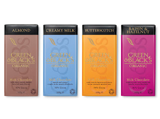


Stock and print driven - Foiling


DC - Brief 0 - Raw
Source: http://www.pearlfisher.com/our-work/packaging/raw/
Print and stock driven - Cut out, sustainable stock


Print and stock driven - Cut out, sustainable stock


DC - Categorising & defining content
Order of content:
Summary Page:
What its all about, my personal interest
Categories:
Each with brief summary
Aesthetic Value -
For the sole purpose of looking aesthetically pleasing, to entice customers to purchase the item, through use of colour, texture or image.
Content Driven -
A packagings designs decisions is determined by the content with packaging or product.
Form follows function -
It's sole purpose is to package and hold.
Ecologically Considered -
A packagings design choices has considered its environmental impact.
Ergonomic -
The packaging has been formed to be ergonomically friendly to a person interaction with the product
Luxury -
A high quality design, using a range of creative methods to make the packaging look luxurious and high end.
More than just packaging -
A product which has more purpose than just packaging an item.
Stock and print driven -
Design choices have been driven by stock, printing processes and finished.
A professionals perspective:
Interviews
Subscribe to:
Posts (Atom)
