Sunday, 5 May 2013

FMP - Brief 1 - Changes

So after reassessing the direction of my packaging design I have decided to keep the colour palette just one colours + plus, after realising it was too close to the iconic Ikea colour palette. I have also decided to expand the target audience past England, to be European - to be based across France and Spain. So this will need to be considered regarding the language barrier with the text content.

I have also decided my range needs to be numbered to support and evidence the concept of 'ten things' - a line of 10 products. With this I have also thought more about colour palette, and the overall product line - each individual product needs to be deciphered as working on its own and as part of a set. So working with colour hue I've decided each product will be a slightly different colour blue. Looking on Kuler ( https://kuler.adobe.com ) to find a range of blue shades I came up with the below colour palette:


FMP - Reassessed to do list


Be-ro 
Posters - Flour template
Laser cut sign
Envelope for invite
Packaging in context
Website

DC
Publication design
Collect content
Organise Content

10 Things 
wrap designs
Packaging design
Product design
Retail Graphics
Promo material

Doing my nut in
Photograph
Boards

Thriftbox
Boards

Everything Beauty
Boards

Laura Ashley
Bags, Tags, Giftwrap - Bulky newsprint
Cushion - Transfer Print
Wallpaper Swatch book

Friday, 3 May 2013

FMP - Brief 4 - Recipe book and packaging

Finally managed to print the recipe book for the event and the packaging with the new proposed colour palette and logo.

The recipe book design, I wanted to communicate the history by providing the old original recipes, within an updated book, with high quality images of the food this recipe book can provide the cooking instructions for, which no previous Be-Ro recipe book did.


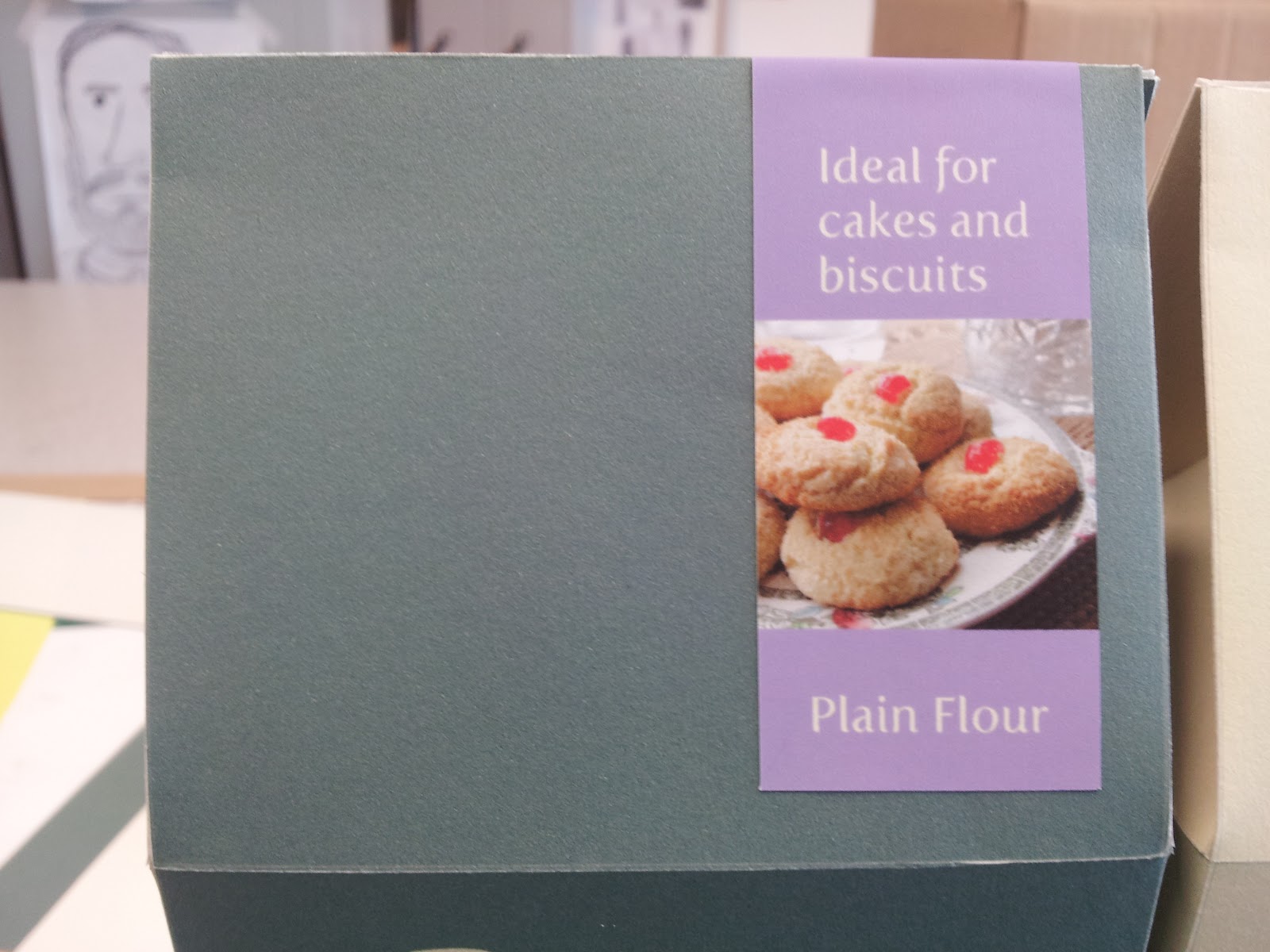
The packaging design I wanted to keep simple, and minimal - from primary research I found other flour packaging designs were full of illustrations, colour and images; keeping it simple amongst a busy shelf will mean it be outstanding on its own. I have made the lip simple, to be easy to re-seal and open. Unlike other packaging designs I am proposing an interior bag, to save from the notorious leaks and spills flours bags have.


Stickers have been designs to communicate exactly what the flour type should be used for, and to also seal the box lid.


FMP - Brief 5 - Production

So after a brief catch up with Sophie over how to approach the designs for the home furnishings, and a plan of action I set to printing the the stickers and arranging them on the products. After hours of cutting and sticking i'm pretty pleased with the outcome and can't wait to see the final product photographs.


Wednesday, 1 May 2013

FMP - Brief 3 - Final Book binding

So after making a decision with stock choice, after the given feedback at the crit I was able to re-produce the front covers on the single leaf publications and get started on the larger publication.


The larger publication

Alongside the singlualr publications, i wanted to produce an overall large combination publication - to add to the range within this brief. After many experiments with binding, I chose the coptic bind to be the most appropriate way to categorise the sections within the publication. I have retained 2 of the 5 stocks to retain consistancy between the range.


I'm amazed at how well I've managed to keep the bind together, as my first attempt was quite ammature. I chose the black stitching to be consistent with the monochromatic colour palette of the content within the publication. The chosen stocks were simply chosen out of the 5 for how well they looked together.


Leafs dividing the categories 


The individual publications


FMP - Brief 1 - Re-assessed direction

So i'm currently really not happy with this brief, after quickly making some nets, applying some colours text and a logo, printing and constructing them I'd realised how lazy i'd been within this brief, considering at one point I wanted to be a packaging designer. So I am dedicating this next week to producing a packaging range I'm proud of.

Firstly the colour palette is a problem, as pre mentioned in a crit, it used the iconic colours of Ikea - Yellow and Blue, so I have decided to change the yellow to a cream - so it won't take to much time to adapt what I've already created.

I want to be more creative with my packaging but have a clear concept. My packaging is to be quite corporate and educational, seeing as services such as Surestart will be offering these to families. I am going to propose a simple minimal design, each item to be numbered, holding a brief description and logo.  Also by using just one colour on stock (blue on antique white) it costs 75% cheaper to produce through printers. 

I have taken inspiration from the following designs:


The designs sketched:


FMP - Brief 5 - Fabric Construction

With the fabric digitally printed, me and Sophie thought it a good idea to construct our own pillow case and coffee table runner. I manage to pull a favour from Thirftbox owner Lauren, as a favour to help me out.