Showing posts with label Brief 8 Thriftbox Context. Show all posts

Tuesday, 16 April 2013

FMP - Brief 8 - Getting things moving

So I picked up a few materials - Fabric and tissue paper to screen print onto, to use for wrap and the sew on labels. I tried to get colours as close to her branding, and the white to suit every product she makes.


Also got the stamp delivered so very happy about that, I've ordered a colour ink as close to her branding again.


The stock pre-mentioned that i looked at whilst at Beautiful meme got delivered, and is amazing, looks just like fabric so will be printing her business cards onto that soon.


Monday, 8 April 2013

FMP - Brief 8 - Compiling Contacts


I wanted to compile a list of suitable contacts to send laurens promotional mail out to, instead of giving them out blind. I think its important that we really give thought to who we are trying to aim her products at. Thinking along the line of retailers, who have set up a craft business because they have an interest within it, is the market I think would be suitable to market at. I have found local businesses which we will be sending the mail outs to. 

Reetsweet:

reetsweetevents@gmail.com

Birds Yard:

'Bird’s Yard is a true treasure trove – a three storey building that celebrates creativity and individuality. Unique boutiques, designer displays, creative retail spaces and a lovely tea shop sprawl throughout the maze of rooms.'
Contact:
Bird Shell
Bird's Yard, 83 Kirkgate
Leeds, LS2 7DJ

The marvellous tea dance company:
About: 
Established in 2006, The Marvellous Tea Dance Co. is Yorkshires original and authentic vintage events and catering company.
Our passion for all things kitsch, vintage and cakey inspires us to organise and host wonderful tea parties and vintage inspired events, creating memorable occasions for all!

Contact:

The Marvellous Tearoom
Ground floor, Birds Yard
83 Kirkgate, Leeds
LS2 7DJ


Leeds Corn Exchange:
Corn Exchange
Call Lane
Leeds


Companies - Candy Candy, Dee's Wardrobe, Mummy and little me, The gift closet, Yellow Sunrise.

Leeds craft club

About: 
We are a group of crafters who meet monthly at White Cloth Gallery in Leeds, on the second Monday of every month. We're always looking for new members!

White cloth gallery, 26 Aire Street Leeds LS1 4HT

The craft centre and design gallery
City art gallery
the headrow
leeds
LS1 3AB

Craftwise
1-3 Merrion Centre
Leeds
LS2 8NG


Duttons for buttons

Duttons for Buttons
32 Coppergate
YORK
YO1 1NR


3 Church Street
ILKLEY
LS29 9DR


Bonds Of Farsley
93-95 Town St
Farsley
Leeds
LS28 5HX


Scrap Creative Reuse Arts Project Ltd
Aire Place Mills
Kirkstall Road
Leeds
LS3 1JL


Friday, 5 April 2013

DC - Brief 8 - Fabric Mail out

Source:http://www.behance.net/gallery/Fabrication-inspired-by-Michel-De-Certeau/6476761

Me and Lauren discussed producing a small mail out promotional piece to send out to try and get her more business. I thought it important to incorporate her textiles into the piece, so to create a fabric based book with a thread binding. This is just one example of something I could produce.


Wednesday, 3 April 2013

FMP - Brief 8 - Material

Source: http://generationpress.co.uk/archives/3483

I want to try and incorporate some of Thirftboxes material of design elements so I researched into ways its been done before:


Incorporating Material


Brief 8 - Belle Ninon identity

Source: http://visualgraphc.com/post/46942569635/belle-ninon-new-identity-by-chateau-batard

Since Lauren mentioned she has a 2 colour scheme for her purse designs I've thought that an overall 2 colour palette + stock would be an appropriate way to approach her identity. The below designs show an example of how this could be done. The idea of using pattern has really appealed to me, since Thirftbox uses a lot of patterned fabric within their products.


Tuesday, 2 April 2013

FMP - Brief 8 - incorporating process

I thought a good direction would be to incorporate the process Lauren would have to go through to produce the items she does, so that includes sewing, threading, painting, cutting etc. Below are a few directions I would like to try.

Source: http://visualgraphc.com/post/42552898830/neu


Source: http://visualgraphc.com/post/44478567752/manor-studio


DC - Brief 8 - Letterpress

Source: http://theprintproject.co.uk/portfolio/leeds-print-festival-pop-up-print/

So a potential printing method i wanted to look into was letterpress.


FMP - Brief 8 - Exploring format

After discussing with Robyn from BM my brief, she suggested I tried doing something with Thirft box which hadn't been done with a similiar company before. I wanted to explore business card format as a start.

Source: http://www.beastpieces.com/2012/06/ilumini-photography-arts-business-card/


Source: http://www.beastpieces.com/2011/12/hard-graft-print-collateral/


DC - Brief 8 - Thriftbox - Carpet Designer business cards

Source: http://www.beastpieces.com/2012/07/beautifully-patterned-business-cards/

Letterpress printed on French Poptone Whipped Cream 140C, custom duplexed after printing to make 280C.

I love the concept behind these business cards and have always wanted to have a go at letterpressing, after talking to the guys at beautiful Meme, to my understanding, the image would be letterpressed too. They recommended the print project if this goes ahead as an idea as someone to print it.


FMP - Brief 8 - Embroided business cards

After coming across this invite within my DC blog:


I have decided it would be an amazing approach to take with Thrift Box, incorporating the fabric and textile elements. I have contacted tolley badges asking whether ti would be possible, and to get a quote.

Source: http://www.tolleybadges.co.uk


Other companies I could try:

http://www.patchesdirect.co.uk/
http://www.wovenpatches.com

Thursday, 28 March 2013

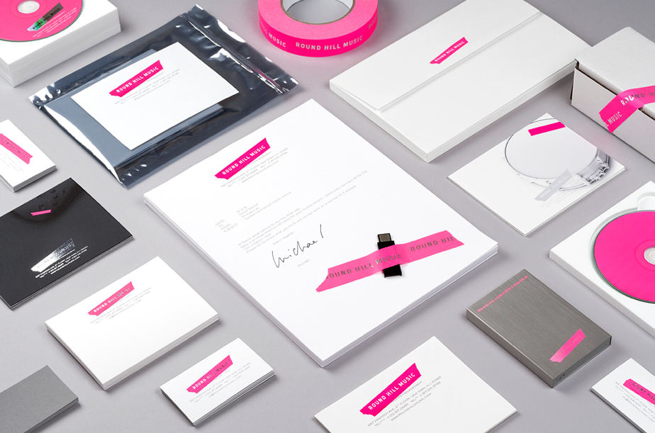
DC - Thrift Box - Round Hill Music

Source: http://www.septemberindustry.co.uk/established-nyc/

I'm not particually looking at the design of this range in relation to Thriftbox as I'm sure it doesnt reflect her products, but instead the range which has been designed. The idea of using a craft material to create a logo is something I feel is something which could be used - here they have used a tape material, which has then been pushed into the packaging elements. With Thriftbox I could use a material appropriate to the items she makes. I also like the huge extent of the range of this line of products, and is something I should consider in the design stages of Thriftbox.


Monday, 18 March 2013

DC - Brief 8 - Compiling Examples for Meeting

Over Easter I wont have internet access so I thought I would try and get on with Thrift Boxes branding in the time. So I've decided to compile some examples, to meet up with Lauren and see what style of branding she is wanting. Going on what she sells, I feel a calligraphic, decorative style would reflect her best, but I will show her a bit of everything to see what she likes.

Source: http://www.jessicahische.is/logomakingforaqueenbee

Creating an overall emblem which could be incorporated into other elements of her branding, using a drop capital to become the shops identity - TB - Thirft Box. I like the black and white colour palette used here, it adds an element of simplicity, among a very decorative identity. Thinking of Laurens approach to work, i can imagine stock choice being a main contributor to the branding.


http://www.jessicahische.is/letteringalogoforawonderfullady

A solely typographic approach is something I would also like to approach Lauren with, this will allow me to incorporate pattern and detail amoung other design elements. 


Source: http://www.jessicahische.is/doingthingsthissummer

I came across the below designs and felt a possible approach to Laurens branding, which would add a different element to my overall portfolio content, would be incorporating photography and her products into the business card designs.


Source: http://www.behance.net/gallery/Branding-for-Armour-Sans-Anguish/6718151

Taking a hand made approach, I could look into stamps - it would give lauren a way of printing her products at home, as she doesn't have direct access to a printers.


Source: http://www.solofficial.com/veintisiete/27/37/

A possible approach to stock - Lauren uses alot of pastel colours, which 27 branding does very well, alongside a monochrome typographic branding approach.


Source: http://www.solofficial.com/indigoods-llc/simon-miller/14/

The stitched label is also something I should consider, it would be an easy way for her to brand and promote her products.


Source: http://www.solofficial.com/purificacion-nunez/el-valor-del-tiempo-perdido/20/

In regard to her promotional piece, I would love to create something like the below, incorporating the fabric she uses into a 5 page mail out, screen printing her details and work onto.