
Showing posts with label Brief 4 Be-Ro. Show all posts
Showing posts with label Brief 4 Be-Ro. Show all posts
Thursday, 23 May 2013

Saturday, 18 May 2013


FMP - Brief 4 - Sample packs mock up
Initially i thought it would be a great idea to provide samples of be-ro products within the sample pack, so made tiny packets to hold it. Common sense hit me, realising no one could make anything substantial out of such a small sample. The size couldn't really be avoidable due to the nature of the pack (A4 and flat) so I decided to discard this idea.


Tuesday, 14 May 2013
FMP - Brief 4 - Website
As part of the promotional material for Be-Ro I felt it appropriate to update their current website with details of the event.

Saturday, 11 May 2013
FMP - Brief 4 - Event Pack
I am going to produce a pack to give out at the event to push the re-brand further, I am going to provide an A4 version of the poster already produced, along with a recipe book and samples of the flour products. Alongside this will be a promotional belly band to go around the Be-Ro products in retail, it will act as an invite to the event.


Sample packs

Belly bands for retail products:

Friday, 10 May 2013
FMP - Brief 4 - Invite envelope
I wanted the envelope design to communicate the idea of baking, so decided to produce one using greaseproof paper - a material used within all cake making. I am going to print the address on a white sticker on the back to seal. Another reason for the greaseproof paper was its transparent quality - it slightly reveals the design underneath.


Wednesday, 8 May 2013
FMP - Brief 4 - Re-designed Invites
To be in keeping with the re-assessed event branding, I have updated the invite which I intend to send out to promote the event. I will propose a set of suitable contacts to send these to, these will include traditional bakers, to propose to use Be-Ro products within their baked goods.


FMP - Brief 4 - Promotional Material
I have decided to propose the event to be held in the Corn Exchange in Leeds due to the nature of the building and its history, in reflecting the history or the Be-Ro brand. Alongside this I have decided the branding for the event should differ from the packaging and identity design. The original identity was designed for the purpose of retail and packaging - this wouldn't be appropriate for the event, which is being proposed to make people aware of its heritage and history and the journey its taken.
I chose a monochromatic colour palette to present a classic appearance to the event identity. And took it back to the basics, to represent its journey, by simply using flour, to create a type as image design.
The event promotional poster:

The proposed event material at the Corn Exchange:

Poster designs will be distributed across Leeds to promote the event:


Friday, 3 May 2013
FMP - Brief 4 - Recipe book and packaging
Finally managed to print the recipe book for the event and the packaging with the new proposed colour palette and logo.
The recipe book design, I wanted to communicate the history by providing the old original recipes, within an updated book, with high quality images of the food this recipe book can provide the cooking instructions for, which no previous Be-Ro recipe book did.


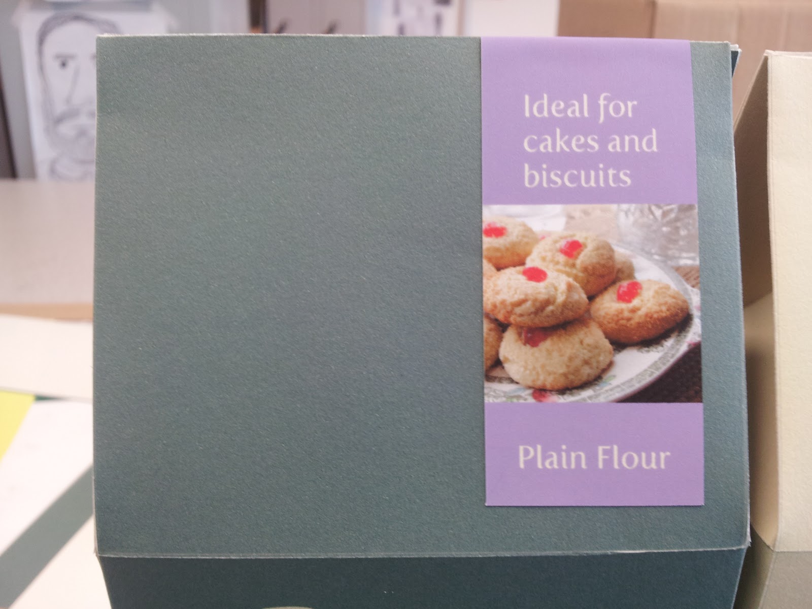
The packaging design I wanted to keep simple, and minimal - from primary research I found other flour packaging designs were full of illustrations, colour and images; keeping it simple amongst a busy shelf will mean it be outstanding on its own. I have made the lip simple, to be easy to re-seal and open. Unlike other packaging designs I am proposing an interior bag, to save from the notorious leaks and spills flours bags have.


Stickers have been designs to communicate exactly what the flour type should be used for, and to also seal the box lid.


Tuesday, 23 April 2013
FMP - Brief 4 - Invite
I wanted to create an invite for the event to be distributed to the general public. Designed to communicate to brand and the heritage of the logo - I intend to wrap the invite in greaseproof paper with string, materials used in baking.


FMP - Brief 4 - Event Illustration in context
I was finding it difficult to design the event, without actually communicating how it would look visually, so I illustrated each of the sections my event will have . This will also help me in the design stages so I can get a better understanding of what it is exactly I need to design. From this I understand that I have yet to design the:
Serviettes
Promo material
Product cocktail labels
Window display graphics
Laser cut wooden logo
In context for boards:


Monday, 22 April 2013
Sunday, 21 April 2013
FMP - Brief 4 - Re-assessed packaging format
Initially I wanted my packaging design to take the form of a cylinder, it seemed a practical way to hold the flour best, as bags and boxes tended to leak the delicate flour material, but I found it particularly difficult to design for and construct. I came across a box design which I felt would be appropriate, a box with concaving sides and a top flap and sticker, to allow easy access and reseal.
After deciding the colour palette to be green, rather than the original Tesco branding like blue, I pushed it across the Bero experience logo, as well as the packaging range. Once I had completed the design I felt it just didn't stand out enough, as on a shelf it would be submerged by other similarly colour products. So I designed the sticker to be a vibrant purple and hold an image of what the product could make, to add further context to the item.
Source: http://lovelypackage.com/holli-molle/#more-4155

The nets created:


The finalised designs:


Subscribe to:
Posts (Atom)
