Showing posts with label Brief 3 Doing my nut in Context. Show all posts

Friday, 22 March 2013

DC - Brief 3 - Quibik

Source: http://www.qubik.com/

I was struggling with ways to lay out my content within my dialect publication, and remembered my visit to Joe Gilmores studio and looking through his work how his style would really help me and influence me in what I'm trying to achieve. The way Joe approached type layout is so interesting, and as it's something I really want to get into to, and to be able to produce to a high quality,I'm going to use Joes work as something I strive toward creating.




Tuesday, 5 March 2013

DC - Brief 3 - Coptic Bind

Coptic Bind

Source: http://www.behance.net/gallery/Laser-Engraved-Recycled-Notebook/2367790

I reaaly, really, really want to try this.


DC - Brief 3 - Potential Binding Craft

Source: http://designspiration.net/image/35139126463/

This again I felt would be an easier way to approach the publication design.


DC - Brief 3 - Layout Inspiration

Source: http://www.septemberindustry.co.uk/the-international-office/

I wanted to look at creative ways of disecting and approaching typography layout, as I don't want my publications to take a standard format as it is spoken language content I'm using - which is different between everyone, so I want my publications to communicate this, so every page, the type is set differently. Looking at the below images, they have each done something playful with the type I could start experimenting with.


DC - Brief 3 - Typographic language posters

Source: http://designspiration.net/image/100302255477/

Like the post above, below are experimentations with typography in the sense of layout and style I could try to achieve and experiment myself with. 


Source: http://www.werkplaatstypografie.org/


Monday, 4 March 2013

FMP - Brief 3 - Ordering Stock

I decided to contact GFsmith to see if I could obtain some samples of their new colour way line to work with my regional dialect book, as I wanted it to have a high level of quality. I also asked for a few samples of other stock I'd seen within their samples books I had obtained last year. I wanted the front page to be either a bold vibrant stock, or quite hard, monochromatic and steel like, so I ordered a range of which I intend to emboss. I have already tested embossing on white stock and the result was a very blind, blind embossing so I'm hoping the within the range of coloured stock I have ordered, something will be more outstanding.


DC - Brief 3 - Cereal

After deciding to focus my Design Context project on food and drink I found an ideal publication. After finding a new found love for all things type and layout, I picked up 'Cereal' with the hope of it inspiring my Doing my nut in brief, but found its content to drive my Context brief.

Its balance of photography and type is what I most favour, and it's consistent layout and grid, which managed to differ between each double page spread. It's made me realise the importance of photographs and images within a publication, and made me want to use more of them within my Regional Dialect publication.


DC - Brief 3 - Gentlewoman

After the crit last week it was suggested I visited Village and Colours may vary, to look at some publications to get some inspiration. I went a little crazy and bought more than I could afford....so apart from living on pasta for a week, I'm really happy with my purchase. This is a first for me, being so interested and inspired by typography and image. 

The Gentlewoman was just one publication I picked up, I really liked to substantial size and quality and feel of it. Each couple of pages seem to be set to their own layout, so every couple of pages are new interesting layouts to look at, each with its own choice of stock. The article on Beyonce is my favourite within the publication, using photography is something I want to do, and I feel this does it so well.


Sunday, 3 March 2013

DC - Brief 3 - Laus

Source: http://heystudio.es/bases-laus-2010/

I came across this project after looking for inspiration regarding production and binding for my publication. I had discussed possible ways to categorise the sections of my book within a crit but didn't really come back with any inspiration. I could take a similar approach to Heystudio in using stock to visually divide chapters. I feel it will add to the overall appearance and professionalism of the finalised piece.


Thursday, 28 February 2013

DC - Brief 3 - Justified

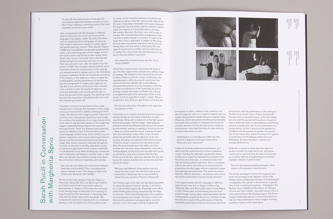
Bought this today. Bloody love it. It's approach to image and type in the sense of layout isn't really something I've seen before but I'm starting to get a real liking for type and layout which is experimental. I want to start collecting such one publications for inspiration.


Wednesday, 20 February 2013

DC - Brief 3 - Heydays Snitt Magazine

Source: http://heydays.no/2010/snitt/

The way its approached its headers and titles is the main influence this publication has on me. It could be a nice way to approach spoken language within the information part of my publication.