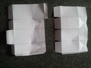
Initially I wanted my packaging design to take the form of a cylinder, it seemed a practical way to hold the flour best, as bags and boxes tended to leak the delicate flour material, but I found it particularly difficult to design for and construct. I came across a box design which I felt would be appropriate, a box with concaving sides and a top flap and sticker, to allow easy access and reseal.
After deciding the colour palette to be green, rather than the original Tesco branding like blue, I pushed it across the Bero experience logo, as well as the packaging range. Once I had completed the design I felt it just didn't stand out enough, as on a shelf it would be submerged by other similarly colour products. So I designed the sticker to be a vibrant purple and hold an image of what the product could make, to add further context to the item.
Source: http://lovelypackage.com/holli-molle/#more-4155
The nets created:
The finalised designs:


No comments:
Post a Comment